Whitespace
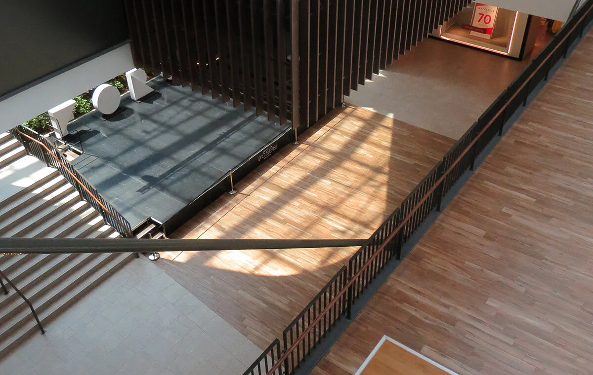
Image: Forum Gdańsk, photo by Gregory Ronczewski
Gregory Ronczewski is the Director of Product Design at Ibbaka. View his skill profile.
It is called white space (whitespace), a breathing room, or negative space. There are many terms to describe one of the critical ingredients of art, design or architecture. If you place together a few graphical objects they either need space to express their own identity or, if arranged closer, confirm belonging to the same group. It works like magnets - if you keep closing the gap between two magnets, at some point they just cling to each other. Any object, to fully communicate its message, needs breathing space. A distance from the margins of a given canvas, or from the other elements. It is a delicate balance, and if the rules are obeyed, the design emanates a calm, natural air. If not—sometimes, this arrangement is broken for a reason—tension points emerge, causing a different message to take over. Confusion and chaos sets in.
For a keen observer, this play of magnetic forces can be observed in any layout regardless of what medium it is used - from the covers of magazines to the complicated structure of public spaces.
Two weeks ago, I took a train from Sopot which is located on the coast of the Baltic Sea in Northern Poland to Kraków. It is a comfortable six hours ride on a bullet train covering over 600 km. Since 2006, Kraków train station is connected to a large shopping mall. In 2007, this shopping mall (Galeria Krakowska) received an award for the worst building, specifically criticized was its architectural form. It covers nearly 129,000m2, and I can see why, for many, it was a mistake to build something like this in the center of the city.
Nevertheless, it is now a permanent feature of Kraków, and you can't miss it if you travel by train. There is another shopping centre similarly placed close to the Gdańsk train station which was open in 2018. It is almost 50% smaller (62,000 m2), but it feels much more prominent because of the open space, which makes a visit quite pleasant. My curiosity and the heatwave submerging the city into 35ºC baking hot took me to yet another center, M1 in Kraków - this one from 2001 and what a difference. Most of the stores representing various brands were similar in all three spaces: the same products, the same stores, the same adverts and people seeking relief from the heat. The only difference was the negative space - the space occupied by nothing. The amount of air was the deciding factor. This alone created a totally different experience and confirmed my conviction that the non-existing plays a critical role.
I left the oldest mall right away. It was better to be outside. I am not a fan of spending time inside shopping centres, however, Forum Gdańsk was a surprise. The mall was busy, the day was hot, and the burger served at Pasibus was the best I had in my life. Somehow it did not feel that I was sitting inside a shopping gallery. I believe the whitespace was a deciding factor in my very positive experience.
I wonder when we design a competency model, should we consider adding whitespace or whatever synonym we should use to describe it? And if we supply the editor with this air-brush ability, what are we expecting to achieve? A competency model or a skill profile connected will clearly, and with a high level of precision, guide the skill gap analysis that we need. But at the same time, perhaps some degree of distance, the ability to see a career from a perspective will supply both, the skill model editor and the skill profile owner with a more personal approach.


